CASE STUDY
CASE STUDY
Leveris is a modular banking platform, designed as a flexible and quick-to-market solution for banks to launch new and state-of-the-art product offerings.
Banking is broken. Traditional banks are hamstrung by legacy technologies that have become impossible to manage, impossible to improve and expensive to operate. Leveris has developed a standalone suite of applications that can be “plugged in” as required, allowing clients to create new banking systems, unencumbered by legacy issues. I worked with Leveris during the early stages of the product’s development. The primary focus of my work was the delivery of a prototype consumer banking app to showcase the extensive capabilities of the platform.
Applying for a mortgage can be arduous. Borrowers face a complex legal and financial process involving multiple stakeholders; the complexity of which is compounded by the lack of transparency surrounding the entire process. Enter Abakus. Abakus has created a whole new way of applying for a mortgage. The platform gives borrowers full visibility over every stage of their application, whilst providing new and innovative methods to configure and manage the terms of their loan.
If ever there were a dream project for a product designer to work on, reimagining an entire consumer banking application has to be among them. It was an opportunity to completely rethink a fundamental online user experience and to rebuild it from the ground up.
Together with the business analysis team, we began extensive research into the product offerings of both incumbent banks and by the new breed of challenger banks. Potential features were analysed and categorised by degree of importance, user expectations and development effort, with a special focus being given to differentiators which could demonstrate the capabilities of the Leveris platform.
We created a detailed backlog of requirements, prioritised them accordingly, and began work on those which we considered crucial for an MVP. The team created high-level epics, and from there developed user stories describing the requirements of individual features.
The product design was kickstarted by mapping out the high-level IA of the app. As Leveris is a modular platform, we needed to create an architecture that could be customised by the client depending on which product features they required. This was achieved by allowing the customer to add, remove and re-order individual modules.
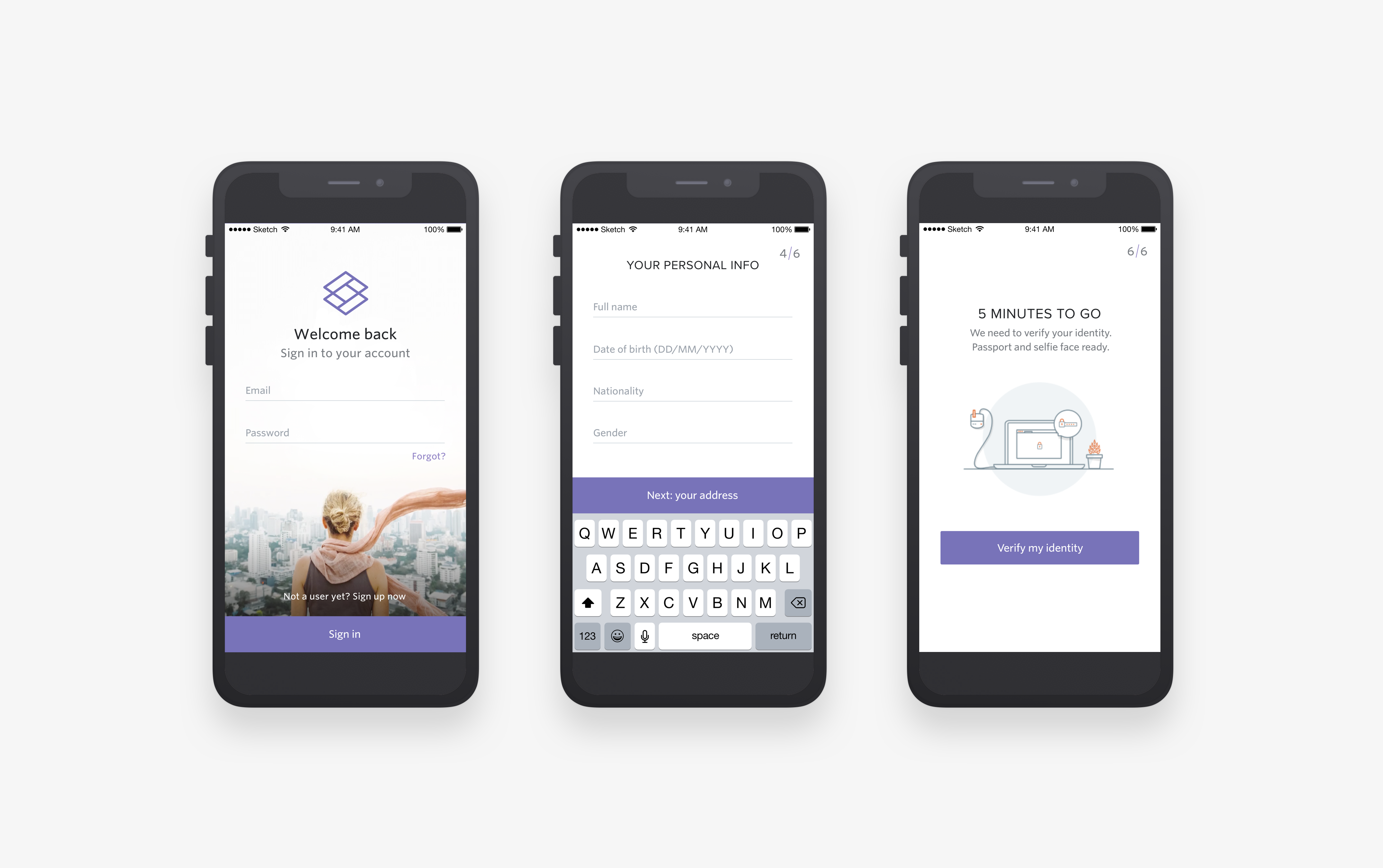
The prototype was designed both as an MVP and as a product demo for potential clients. For this reason we payed particular attention to the initial onboarding flows of the app - this would be the client’s first view of the product, and our first chance to make an impression.
The product design was kickstarted by mapping out the high-level IA of the app. As Leveris is a modular platform, we needed to create an architecture that could be customised by the client depending on which product features they required. This was achieved by allowing the customer to add, remove and re-order individual modules.
The prototype was designed both as an MVP and as a product demo for potential clients. For this reason we payed particular attention to the initial onboarding flows of the app - this would be the client’s first view of the product, and our first chance to make an impression.
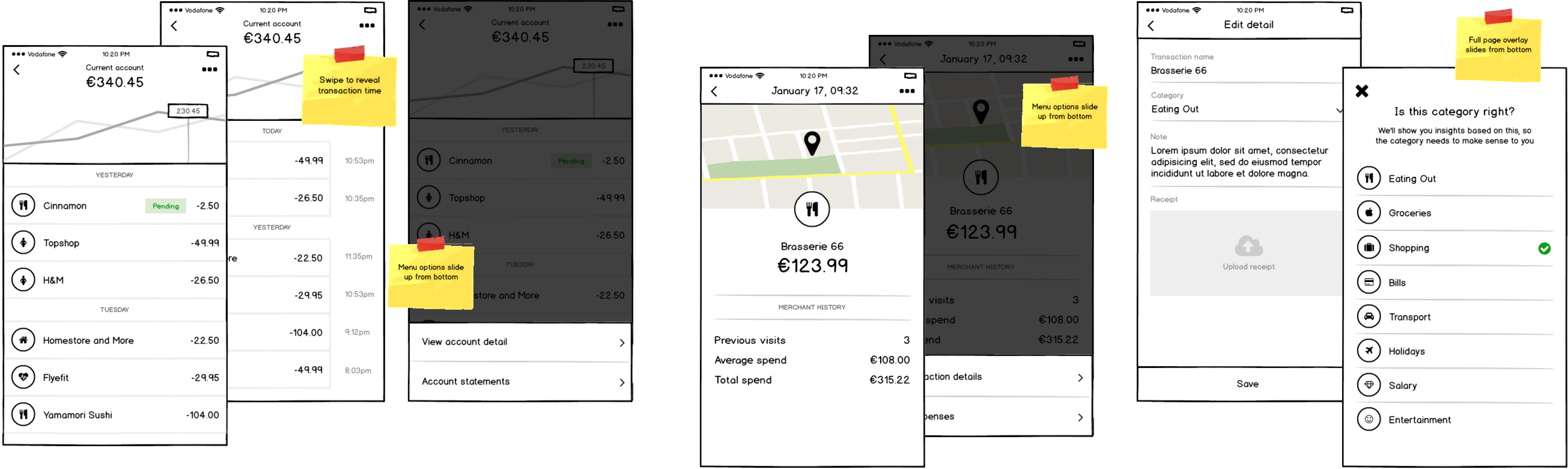
The UX for the application began life as paper prototypes, which facilitated the wider team having input into our initial flows - whilst also allowing us to iterate upon them rapidly. We then moved from paper to Balsamiq to create more in-depth wireframes which detailed sub-flows, different page states and interactions.
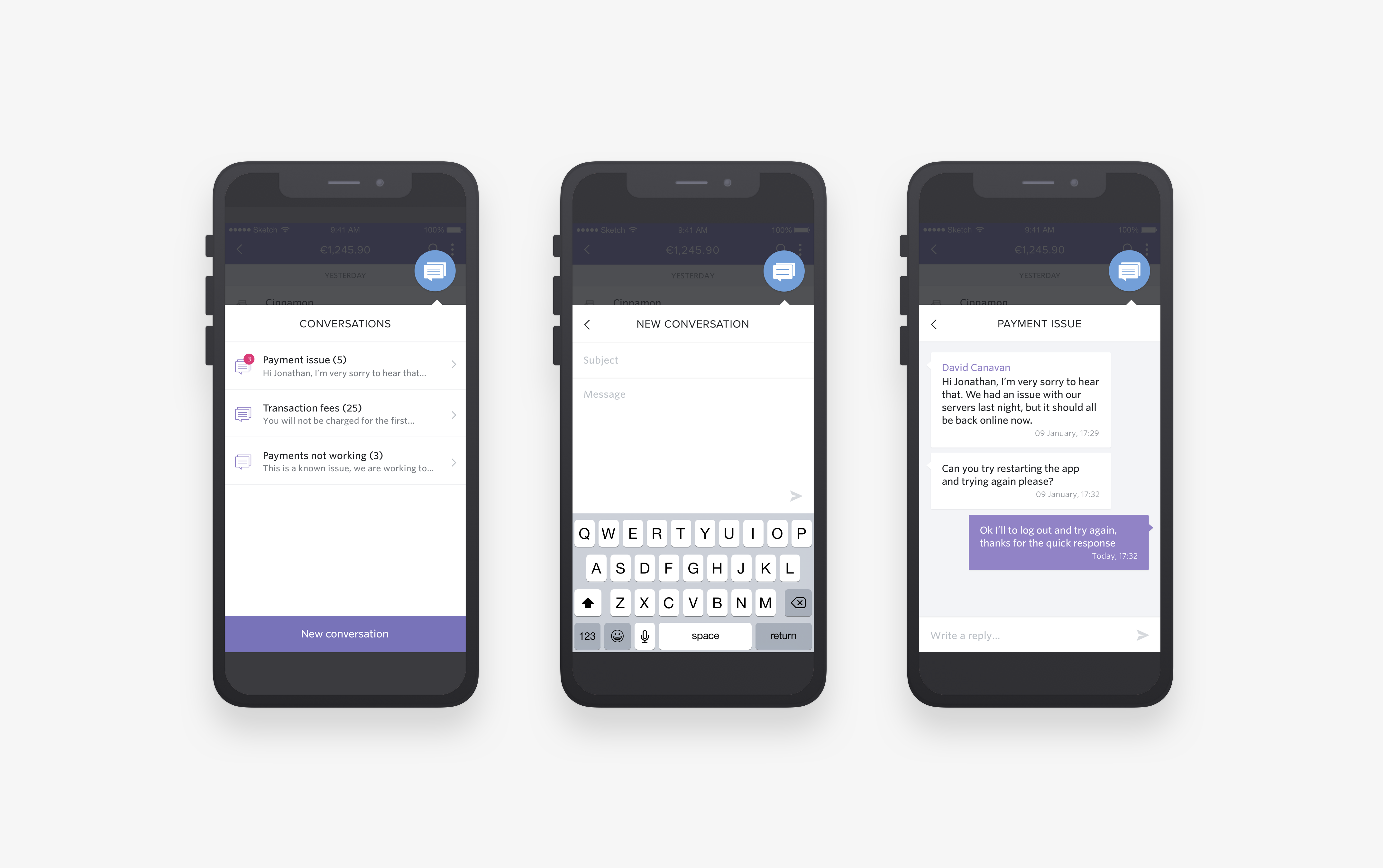
In parallel to developing the UX of the application, the design team worked on creating a strong brand that would work for both the app and the parent company. The branding needed to present Leveris on two fronts - as a contemporary tech company building cutting-edge tech, and as a credible financial organisation that banks could trust with their business. We centered the look and feel around a clean and legible UI. The design of solid UI components was our main priority, which in turn influenced the overall direction of the branding.